walllet brand.

walllet brand.

walllet brand.

We’re excited to collaborate with you and share a short rationale behind our brand name and identity.

We’re excited to collaborate with you and share a short rationale behind our brand name and identity.

We’re excited to collaborate with you and share a short rationale behind our brand name and identity.

Download Brand Kit

Download

Logo-mark, Logo-type and more.

ZIP

1.3 MB

Background Shape
Background Shape

Why “walllet”
with 3 Ls?

Why “walllet”
with 3 Ls?

Why “walllet”
with 3 Ls?

In the world of global payments, we weren’t just looking to build another money app; we wanted to create a new experience. That’s why we chose:

In the world of global payments, we weren’t just looking to build another money app; we wanted to create a new experience. That’s why we chose:

In the world of global payments, we weren’t just looking to build another money app; we wanted to create a new experience. That’s why we chose:

it’s not a wallet. it’s walllet.

it’s not a wallet. it’s walllet.

it’s not a wallet. it’s walllet.

The triple-L in our name is intentional, not a typo, but a statement.

Background Shape
Background Shape
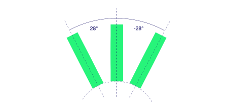
walllet logo mark: three Ls like coins in a wallet
Three Ls
Three Ls
Three Ls

Three coins inside a wallet, viewed from the side
Background Shape
Background Shape
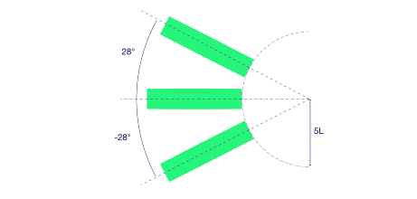
walllet logo mark forming the letter W
Letter "W"
Letter "W"
Letter "W"

These coins jump up and subtly form a W.

"the first letter of our brand"
Background Shape
Background Shape
walllet logo mark forming the number 3
Number "3"

This forms a visual metaphor that connects with Web3 (the “3”) and reflects how we think differently about wallets

More...

Here is more about our brand, Identity and design vision

The power of simplicity

We chose the clean, public-facing domain: walllet.com A word-mark without prefixes or suffixes, minimal, strong, and native to the Web3 world.

Feature Image

Our own vocabulary

Our tagline

Always simple

The power of simplicity

We chose the clean, public-facing domain: walllet.com A word-mark without prefixes or suffixes, minimal, strong, and native to the Web3 world.

Our own vocabulary

Our tagline

Always simple

walllet domain and main logo

More...

Here is more about our brand,

Identity and design vision

The power of simplicity

We chose the clean, public-facing domain: walllet.com A word-mark without prefixes or suffixes, minimal, strong, and native to the Web3 world.

Feature Image

Our own vocabulary

Our tagline

Always simple

The power of simplicity

We chose the clean, public-facing domain: walllet.com A word-mark without prefixes or suffixes, minimal, strong, and native to the Web3 world.

Our own vocabulary

Our tagline

Always simple

walllet domain and main logo

Colors.

Colors.

Colors.

This primary palette forms the fundamental
color scheme of the brand

This primary palette forms the fundamental
color scheme of the brand

This primary palette forms the fundamental
color scheme of the brand

Typography.

Typography.

Typography.

The three typefaces that define the brand

The three typefaces that define the brand

The three typefaces that define the brand

Minimum size.

Minimum size.

Minimum size.

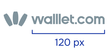
The logotype, whether in horizontal or vertical lockup,

should not be used smaller than 120px in width to ensure readability.

When necessary, the sign alone may be used at a minimum size of 21px,

only in monotone. These guidelines apply strictly to digital environments.

The logotype, whether in horizontal or vertical lockup,

should not be used smaller than 120px in width to ensure readability.

When necessary, the sign alone may be used at a minimum size of 21px,

only in monotone. These guidelines apply strictly to digital environments.

The logotype, whether in horizontal or vertical lockup, should not be used smaller than 120px in width to ensure readability.

When necessary, the sign alone may be used at a minimum size of 21px, only in monotone.

These guidelines apply strictly to digital environments.

walllet logo at minimum size
walllet.com full-color logo
walllet.com stacked logo
walllet.com logo mark

Logo misuse.

Logo misuse.

Logo misuse.

Reference these suggested guidelines when
using the walllet.com identity in your projects.

Reference these suggested guidelines when
using the walllet.com identity in your projects.

Reference these suggested guidelines when
using the walllet.com identity in your projects.

Incorrect logo use: resized out of proportion

Do not resize the logo without maintaining its proportions


Incorrect logo use: shadows or gradients added

Don’t apply shadows, gradients, or any visual effects


Incorrect logo use: color changed

Don’t change the color of the logo


Logo rule: the logo mark sits to the right of the logotype

The logo-mark must always be placed to the right of the logotype
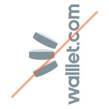
Incorrect logo use: rotated logo

The logo must not be rotated in any direction

Incorrect logo use: transparency changed

Don't change the transparency of the logo

Incorrect logo use: logotype placed above the logo mark

The logotype must not be placed vertically above the logo-mark

Incorrect logo use: outlined logotype

Do not Outline Logotype